| [ << Music engraving ] | [Top][Contents][Index] | [ Literature list >> ] |
| [ < Engraving details ] | [ Up: Engraving details ] | [ Optical spacing > ] |
Music fonts
The images below illustrate some differences between traditional engraving and typical computer output. The left picture shows a scan of a flat symbol from a hand-engraved Bärenreiter edition, while the right picture depicts a symbol from an edition of the same music published in 2000. Although both images are printed in the same shade of ink, the earlier version looks darker: the staff lines are heavier, and the Bärenreiter flat has a bold, almost voluptuous rounded look. The right scan, on the other hand, has thinner lines and a straight layout with sharp corners.
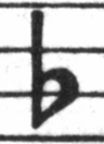 | 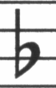 | |
| Bärenreiter (1950) | Henle (2000) |
When we wanted to write a computer program to create music typography, there were no musical fonts freely available that could match the elegance of our favorite scores. Undeterred, we created a font of musical symbols, relying on nice printouts of hand-engraved music. The experience helped develop a typographical taste, and it made us appreciate subtle design details. Without that experience, we would not have realized how ugly the fonts were that we admired at first.
Below is a sample of two music fonts: the upper set is the default font in the Sibelius software (the Opus font), and the lower set is our own LilyPond font.
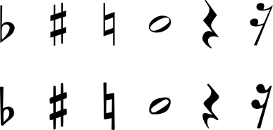
The LilyPond symbols are heavier and their weight is more consistent, which makes them easier to read. Fine endings, such as the ones on the sides of the quarter rest, should not end in sharp points, but rather in rounded shapes. This is because sharp corners of the punching dies are fragile and quickly wear out when stamping in metal. Taken together, the blackness of the font must be carefully tuned together with the thickness of lines, beams and slurs to give a strong yet balanced overall impression.
Also, notice that our half-note head is not elliptic but slightly diamond shaped. The vertical stem of a flat symbol is slightly brushed, becoming wider at the top. The sharp and the natural are easier to distinguish from a distance because their angled lines have different slopes and the vertical strokes are heavier.
| [ << Music engraving ] | [Top][Contents][Index] | [ Literature list >> ] |
| [ < Engraving details ] | [ Up: Engraving details ] | [ Optical spacing > ] |