| [ << Music engraving ] | [Top][Contents][Index] | [ Literature list >> ] |
| [ < Optical spacing ] | [ Up: Engraving details ] | [ Optical sizing > ] |
Ledger lines
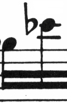
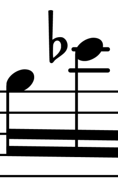
Ledger lines present a typographical challenge: they make it more difficult to space musical symbols close together and they must be clear enough to identify the pitch at a glance. In the example below, we see that ledger lines should be thicker than normal staff lines and that an expert engraver will shorten a ledger line to allow closer spacing with accidentals. We have included this feature in LilyPond’s engraving.
 |  |
| [ << Music engraving ] | [Top][Contents][Index] | [ Literature list >> ] |
| [ < Optical spacing ] | [ Up: Engraving details ] | [ Optical sizing > ] |