| [ << Music engraving ] | [Top][Contents][Index] | [ Literature list >> ] |
| [ < The LilyPond story ] | [ Up : Music engraving ] | [ Music fonts > ] |
1.2 Engraving details
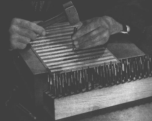
The art of music typography is called (plate) engraving, a term that derives from the manual process of music printing1. Just a few decades ago, sheet music was made by cutting and stamping the music into a zinc or pewter plate in mirror image. The plate would be inked, and the depressions caused by the cutting and stamping would hold ink. An image was formed by pressing paper to the plate. The stamping and cutting was done completely by hand and making a correction was cumbersome, so the engraving had to be nearly perfect in one go. Engraving was a highly specialized skill; a craftsman had to complete around five years of training before earning the title of master engraver, and another five years of experience were necessary to become truly skilled.
LilyPond is inspired by traditional manual engravings published by European music publishers in and towards the end of the first half of the twentieth century, including Bärenreiter, Duhem, Durand, Hofmeister, Peters, and Schott. This is sometimes regarded as the peak of traditional musical engraving practice. As we have studied these editions we have learned a great deal about what goes into a well-engraved score, and the aspects that we wanted to imitate in LilyPond.
| Music fonts | ||
| Optical spacing | ||
| Ledger lines | ||
| Optical sizing | ||
| Why work so hard? |
| [ << Music engraving ] | [Top][Contents][Index] | [ Literature list >> ] |
| [ < Engraving details ] | [ Up : Engraving details ] | [ Optical spacing > ] |
Music fonts
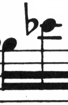
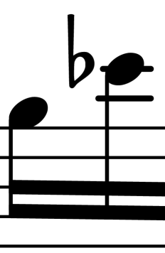
The images below illustrate some differences between traditional engraving and typical computer output. The left picture shows a scan of a flat symbol from a hand-engraved Bärenreiter edition, while the right picture depicts a symbol from an edition of the same music published in 2000. Although both images are printed in the same shade of ink, the earlier version looks darker: the staff lines are heavier, and the Bärenreiter flat has a bold, almost voluptuous rounded look. The right scan, on the other hand, has thinner lines and a straight layout with sharp corners.
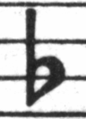 |  | |
| Bärenreiter (1950) | Henle (2000) |
When we wanted to write a computer program to create music typography, there were no musical fonts freely available that could match the elegance of our favorite scores. Undeterred, we created a font of musical symbols, relying on nice printouts of hand-engraved music. The experience helped develop a typographical taste, and it made us appreciate subtle design details. Without that experience, we would not have realized how ugly the fonts were that we admired at first.
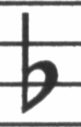
Below is a sample of two music fonts: the upper set is the default font in the Sibelius software (the Opus font), and the lower set is our own LilyPond font.
The LilyPond symbols are heavier and their weight is more consistent, which makes them easier to read. Fine endings, such as the ones on the sides of the quarter rest, should not end in sharp points, but rather in rounded shapes. This is because sharp corners of the punching dies are fragile and quickly wear out when stamping in metal. Taken together, the blackness of the font must be carefully tuned together with the thickness of lines, beams and slurs to give a strong yet balanced overall impression.
Also, notice that our half-note head is not elliptic but slightly diamond shaped. The vertical stem of a flat symbol is slightly brushed, becoming wider at the top. The sharp and the natural are easier to distinguish from a distance because their angled lines have different slopes and the vertical strokes are heavier.
| [ << Music engraving ] | [Top][Contents][Index] | [ Literature list >> ] |
| [ < Music fonts ] | [ Up : Engraving details ] | [ Ledger lines > ] |
Optical spacing
In spacing, the distribution of space should reflect the durations between notes. However, as we saw in the Bach Suite above, many modern scores adhere to the durations with mathematical precision, which leads to poor results. In the next example a motif is printed twice: the first time using exact mathematical spacing, and the second with corrections. Which do you prefer?
![[image of music]](../6c/lily-15c3b141.png)
![[image of music]](../95/lily-184c0193.png)
Each bar in the fragment only uses notes that are played in a constant rhythm. The spacing should reflect that. Unfortunately, the eye deceives us a little; not only does it notice the distance between note heads, it also takes into account the distance between consecutive stems. As a result, the notes of an up-stem/down-stem combination should be put farther apart, and the notes of a down-stem/up-stem combination should be put closer together, all depending on the combined vertical positions of the notes. The lower two measures are printed with this correction, the upper two measures, however, form down-stem/up-stem clumps of notes. A master engraver would adjust the spacing as needed to please the eye.
The spacing algorithms in LilyPond even take the bar lines into account, which is why the final up-stem in the properly spaced example has been given a little more space before the bar line to keep it from looking crowded. A down-stem would not need this adjustment.
| [ << Music engraving ] | [Top][Contents][Index] | [ Literature list >> ] |
| [ < Optical spacing ] | [ Up : Engraving details ] | [ Optical sizing > ] |
Ledger lines
Ledger lines present a typographical challenge: they make it more difficult to space musical symbols close together and they must be clear enough to identify the pitch at a glance. In the example below, we see that ledger lines should be thicker than normal staff lines and that an expert engraver will shorten a ledger line to allow closer spacing with accidentals. We have included this feature in LilyPond’s engraving.
 |  |
| [ << Music engraving ] | [Top][Contents][Index] | [ Literature list >> ] |
| [ < Ledger lines ] | [ Up : Engraving details ] | [ Why work so hard? > ] |
Optical sizing
Music may need to be printed in a range of sizes. Originally, this was accomplished by creating punching dies in each of the required sizes, which meant that each die was designed to look its best at that size. With the advent of digital fonts, a single outline can be mathematically scaled to any size, which is very convenient, but at the smaller sizes the glyphs will appear very light.
In LilyPond, we have created fonts in a range of weights, corresponding to a range of music sizes. This is a LilyPond engraving at staff size 26:
and this is the same engraving set at staff size 11, then magnified by 236% to print at the same size as the previous example:
At smaller sizes, LilyPond uses proportionally heavier lines so the music will still read well.
This also allows staves of different sizes to coexist peacefully when used together on the same page:
![[image of music]](../63/lily-04fa4ac1.png)
| [ << Music engraving ] | [Top][Contents][Index] | [ Literature list >> ] |
| [ < Optical sizing ] | [ Up : Engraving details ] | [ Automated engraving > ] |
Why work so hard?
Musicians are usually more absorbed with performing than with studying the looks of a piece of music, so nitpicking typographical details may seem academic. But it is not. Sheet music is performance material: everything is done to aid the musician in letting her perform better, and anything that is unclear or unpleasant to read is a hindrance.
Traditionally engraved music uses bold symbols on heavy staff to create a strong, well-balanced look that stands out well when the music is far away from the reader: for example, if it is on a music stand. A careful distribution of white space allows music to be set very tightly without crowding symbols together. The result minimizes the number of page turns, which is a great advantage.
This is a common characteristic of typography. Layout should be pretty, not only for its own sake, but especially because it helps the reader in his task. For sheet music this is of double importance because musicians have a limited amount of attention. The less attention they need for reading, the more they can focus on playing the music. In other words, better typography translates to better performances.
These examples demonstrate that music typography is an art that is subtle and complex, and that producing it requires considerable expertise, which musicians usually do not have. LilyPond is our effort to bring the graphical excellence of hand-engraved music to the computer age, and make it available to normal musicians. We have tuned our algorithms, font-designs, and program settings to produce prints that match the quality of the old editions we love to see and love to play from.
Footnotes
[1] Early European printers explored several processes, including hand-carved wooden blocks, movable type, and engraved sheets of thin metal. Typesetting had the advantage of being more easily corrected and facilitating the inclusion of text and lyrics, but only engraving offered the ability to do unimpeded layout and unanticipated notation. In the end, hand-engraved scores became the standard for all printed music, with the exception of some hymnals and songbooks where typesetting was justified by its ease and economy, even into the twentieth century.
| [ << Music engraving ] | [Top][Contents][Index] | [ Literature list >> ] |
| [ < Optical sizing ] | [ Up : Engraving details ] | [ Automated engraving > ] |